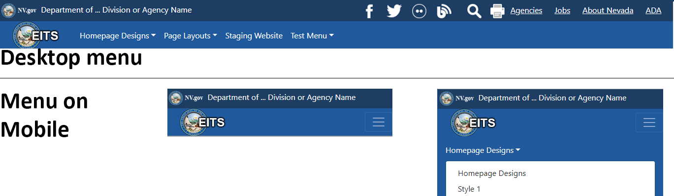
Responsive Header
The new responsive menu has a couple different features designed for mobile and works with desktop. The first thing is that when the users is on the mobile the menu collapses to the mobile menu icon since the menu is to wide to fit on their displays. The other thing you may notice is that it's shorter. The reason is to bring more focus on your content, the reason the user has visited your site.
1. The Agency logo has moved from the header to the menu. When clicked it will take you to the home screen
2. Agency Department and Division is smaller, but still present.
3. The Search and print have been changed to icons to save space. When the Search icon is clicked it transforms the header to a search bar.
4. The Agency List, Jobs, About Nevada, and ADA are still present.
5. You may notice we've also added your social media icons to the header now. Before they were located only at the bottom, but to better keep you better engaged with the population they have been placed in a more prominent spot on the page.